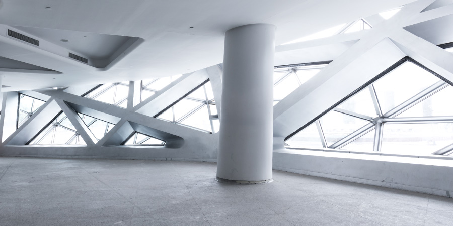
Composition as architecture can be described as the planned arrangement of parts to form a whole.
For architects, the composition is essential because they use mass and space to create an organized expression through composition.
Here I am going to present to you the guidelines for architectural composition:
Symmetry
There is something really satisfying about symmetry, it is aesthetically pleasing to the eye and somehow feels relaxing, Architecture makes great use of symmetry to define its space.


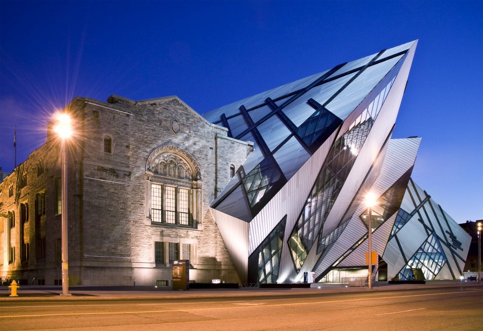
Contrast
It is the difference and separation of elements in a composition, typically resulting from variations in their shapes, sizes, textures, and colors. Too much contrast and the difference can be confusing and chaotic. In order to develop a clear vision, it is important to balance the level of contrast. The objective of contrast in design is to produce variety, avoid monotony and create a diversified effect.
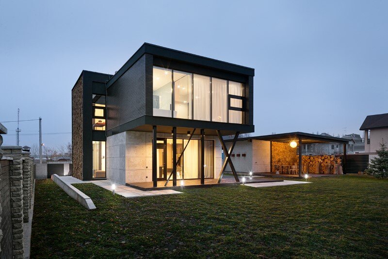
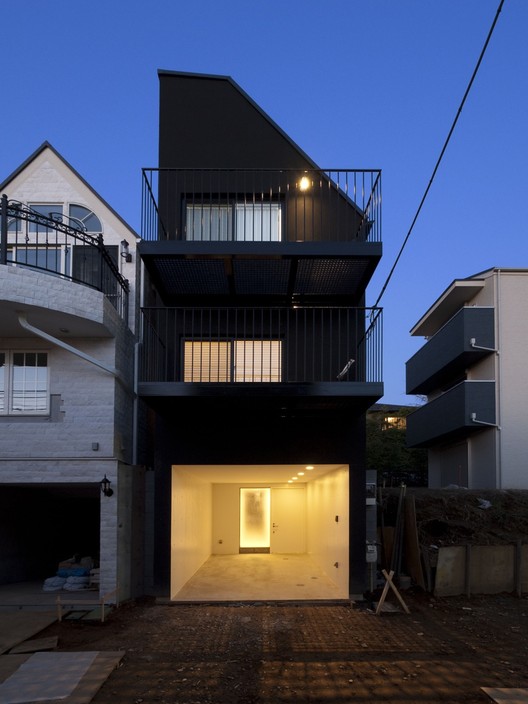
Balance:
Balance creates an equilibrium of the visual forces and a feeling of stability in the composition. It could be either symmetrical or asymmetrical.


Vitality:
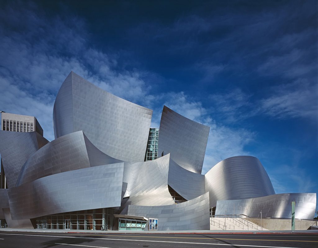
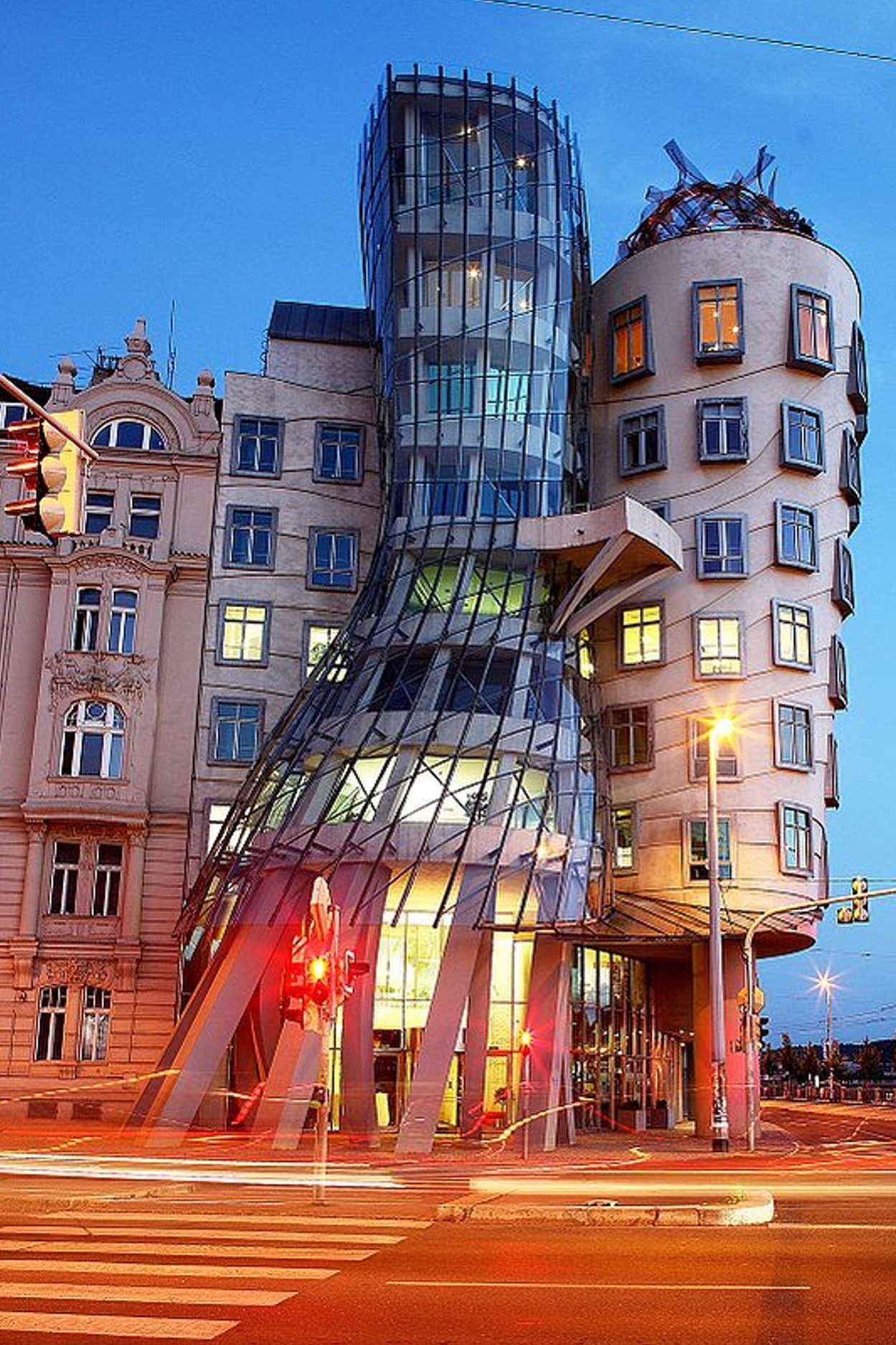
Vitality is the liveliness in buildings, it expresses life and dynamism. We can achieve vitality by contrast but the contrast should be balanced.

Centrality
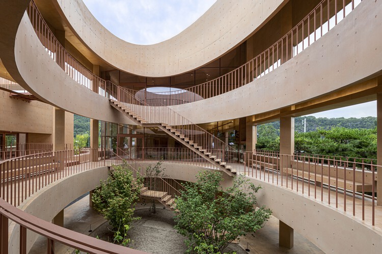
Which signifies arranging and positioning a space around a central point.
Proportion:
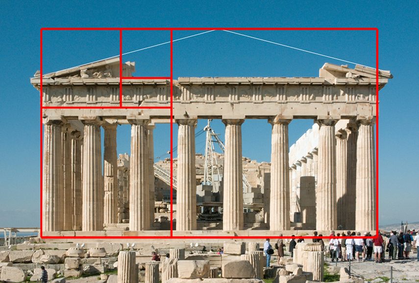
It is the basis of architecture because it refers to the relationship between two objects or between one object’s part and its other parts.
Strength:
It represents stability and durability in architectural composition. This is achieved by using a particular building shape, like a pyramid or rectangle.
